About Me

BA Photography student based in Norwich, England. Interested in travel, fine art, and documentary photography. This blog is a collection of my photos, my travels, and my thoughts.
Showing posts with label zine. Show all posts

Monday, 26 November 2012

Edits, zines, and work experience.

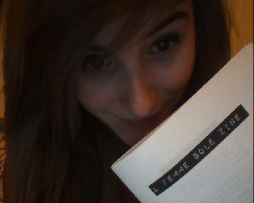
I finally handed in the first half of my project for the year on Friday. I was fortunate enough to have finished everything the night before, so didn't have the panic of the last-minute rush like a lot of my class mates; that doesn't relieve the stress, however, and even now I am panicking at the mere thought of getting my results in a couple of week's time. Luckily, I finished the first edition of my zine completely on time:


Woohoo! Now, I still have a few things I wanna do to it, so think of this as a draft version - I have an illustrator on board who is gonna fill in the blank pages, and a couple more outfits I wanna shoot with to turn it from a 4-outfit look book into a 30-page zine. I also want to play around with the photos a little bit more, maybe take some photographs to work as busy, patterned backgrounds in the photos where the fabric is quite plain. I experimented a little with my favourite photo of Jude, and am totally smitten with the result. Fingers crossed I can make more photos that look just as awesome!


There are a few things going on at the moment that I can't wait to blog about - next week I have a work experience placement for Bentlys Records where I'll be photographing two of their bands as they perform around the city and then at a gig in the evening. I also have some work experience with the Evening News coming up at a later date! As well as this, I have a job interview tomorrow, after being unexpectedly fired, which I'm pretty nervous about - and on top of that I'm in talks with an up-and-coming clothing brand, to photograph their collection for display in the next edition of Femme Sole! I really can't wait to be able to share all of these photos on here, and I hope whoever is reading this is excited to see some new work too.

Friday, 16 November 2012

Manifesto


First edition is all drafted up, just waiting to see if I can an illustrator involved and figure out how small to trim these bad boys! 


Sunday, 11 November 2012

On Friday I was lucky enough to have a shoot with local up-and-coming model Jude Wright, who I've been dying to set up a shoot with as soon as I spotted her a few months ago in a friend's images. We re-shot a few of the images I took a couple of a weeks ago, re-working them and playing with the lighting as well as working with several new dresses.

The first dress we shot with was the same Georgie Gilbert dress as the previous shoot. We revamped the photos by upping the brightness and creating a much more pastel background, whilst keeping Jude bright and sharp. I then used the texture of the dress to add a border to the photos, which works beautifully and really highlights the busy pattern of the dress.


The next dress we photographed was designed by NUCA fashion design student Lizzie Grant. Lizzie's dress was inspired by Japanese kimonos, visible through the beautiful drape of the fabric and loose-fitting, free-flowing arms. Lizzie's dress has taken the traditional perception of a kimono, however, and adapted it to a modern market - tight-fitting and skin-baring, the dress is both comfortable to wear as well as casting a gorgeous, feminine silhouette. We shot with lilac and pink gels on the lights, and again bordered the image using a texture from within the garment itself; this enhances the elegance of the garment, and adds an overall mood to the photograph - whilst the previous dress was busy with pattern, this dress is simple and dainty. 


The final dress we photographed was a 60's prom dress I managed to pick up from my local charity shop for £6. I've been wanting to photograph with it since I bought it, and finally had the opportunity in my shoot on Friday. On Halloween it acted as my 'zombie prom queen' outfit, so we decided to bring out the pouting moodiness once again and make a couple of quite melancholy - though beautiful - images.


Big thanks to Jude for this shoot, and to Becca Mitton for helping with (aka being in charge of) the lighting. I now have a series of works by around 4 fashion students, and so for the end of this short term I'm going to be working on a very small NUCA Fashion Design A/W 2012 Lookbook zine to display this work. Keep your eyes peeled! 

Wednesday, 17 October 2012

For my latest project I have decided to look at fashion photography, and using it as a tool to showcase the work of the designer specifically as opposed to an over-the-top set or the celebrity of the model. First up in this series is the work of 3 NUCA Fashion Design students, and their end-of-year work from their first year at university. After talking, discussing ideas and sharing inspiration over the summer we had very specific ideas for what we wanted to get out of the photoshoots, and from circus themes to a tie-dye background we spent the entire afternoon arranging lighting, posing models and battling 6-foot-tall pieces of polystyrene wrapped in reflective material. This is only the first of many photoshoots, however, and the images will become more refined as I practice my technique. 

For the first-year's end of year work they were given the brief of creating a collaboration between the work of a design house and that of a high-street brand, and to create a garment representing this. I began with the work of Jess Long, who had chosen to combine the work of 'quirky chic' designer label Miu Miu with the on-trend high street store River Island. Taking inspiration from clowns and the circus, Jess's dress takes elements of many of the recent summer trends; from bold polka-dots to heavily-contrasting colours, to a wide, ruffled collar, the dress is almost surreal in its nature. The material used to create the garment adds a softness to the photograph as a whole, despite the harsh blacks of the polkadots or the conflicting green and purple tones, and we chose to use soft lighting in the image both from the front and behind to add to this. 


Next was the work of Georgie Gilbert. Georgie's collaboration was between Mary katrantzou, who uses household objects as inspiration for her vibrant print designs, and Whistles, a high street store that caters for women seeking a feminine silhouette and classic cuts. Georgie took inspiration from the concept of afternoon tea and the structure of a teacup, and used these elements to create a soft and feminine floral dress that really compliments the wearer. For this photograph we used the soft, pastel colours in the dress and projected them onto the background to create a gradient that adds a dream-like nature to the image as a whole. 


Finally, we shot a simple test shot for designer Kristen Loveday. Kristen's project was based on a collaboration between a designer called Sybilla and the high street brand Coast, and she took inspiration from the work of painter Jack Vettriano. The work of Vettriano is filled with elegance, just as Kristen's dress is, but also contains an element of seduction. The deep v of the back reflects this seduction, as does the romantic and feminine drape of the material used. Kristen and I are currently in the process of setting up a location shoot to show off the retro vibe of the dress, and as such I should have more work to share on this blog very soon.

Saturday, 14 July 2012

Off the Beaten Path

As a 20 year old female, I've not been traveling independently for long. I've made two trips to Berlin, the first of which we were led around by our uni tutors, and, though left to our own devices at night, we followed the second-years around in the hopes that they were more knowledgeable than us as timid first-years. The second trip to Berlin was far more self-led, but we were also accompanied by my elder sister, who was living in Berlin for the summer and who, alongside her fiance, pulled us out of more than one sticky situation (imagine two drunk teenagers staggering around Berlin at night trying to find their way back to the hostel, and you have a good image of what one of those situations was). I've made one to Prague, which was again directed by the university apart from when the sun went down, when we consulted our guidebooks and the internet in the hopes of reading about a decent bar that we - three girls who wanted to dance, one who didn't want a crazy club night, one gay man who wanted a 'big gay night out', and a couple of guys who were happy with a jazz club - could all agree on: on one of the nights we found ourselves being led by a group of Americans who had stumbled drunkenly into the hotel, rather than having the same 'shall we go here?' 'no, god, what are you thinking?' conversation as the night before. And, as we all know, I've had one trip to Krakow - and this is the one that I consider to be a truly 'independent' trip.

I've read many travel blogs, however, that seem to think that a trip cannot be truly 'off the beaten path' or even vaguely 'independent' unless there is no hint of a travel guide, in human form or book, in sight. I've read blogs in which the writer insists that everyone who uses a travel guide on their journeys must trails after one another, sheep-like, to the same restaurants, bars, sights and museums. That a 'culture' has been born, one that breeds travellers of a certain age, who read the 'trendy' guidebooks and who all have the same 'gap yah' attitude - an attitude that, blatantly, nobody but a 15 year old lad would want to deal with while trying to travel. However, I can't help but disagree with the overriding factor being argued in these blogs and articles.

Without guidebooks, and the help of people around me who know the area, I would have found myself lost, confused, and, to be honest, pretty scared while travelling. On the first day of our trip to Krakow, I realised how little I'd prepared myself for the journey. I hadn't really looked at any maps and therefore had no sense of direction when it came to simply leaving the train station and heading to the Old Town, where our hostel was. We spent that day wandering around merely trying to figure out which direction was up and which was down; which direction led to desolate countryside and which direction would guide us to culture and life. That night, I laid down in my bed and spent the night (well, some of the night - after a while I dozed off thanks to the extra-strength painkillers I'd taken) reading through 3 separate guidebooks, spreading out a map over the top of my duvet, and planning an itinerary and route for the next day. Without the guidebooks (In Your Pocket, Lonely Planet, and a brochure of events from the Tourist office) I would have been laying there pondering what I could attempt to find for us tomorrow. We would have ended up wandering around Old Town monotonously, hunting down the side streets for potential exhibitions or areas of interest, not knowing how close/far Wawel Castle was or what route to take to Kazimierz.

Besides, what difference is there between researching the country you're going to and making your own list of places you'd like to visit, and using a book that has a concise, helpful and organised directory of the exact same things? The only difference is the attitude of self-righteousness that comes in believing you have 'discovered' these places for yourself. 'Off the beaten path' should not distinctively mean 'something that nobody else knows about': sticking to that deformed definition does not make somebody an intrepid explorer, it simply makes them a hipster, somebody who wants to claim that they were the first to discover a sight, some ruins, or that independent coffee shop that is only used by locals. On the contrary, 'off the beaten path' should simply be used to describe an experience that bring something new, something unusual to the one doing the travelling - whether that be a desolate building in the middle of the city, a stroll along the lake that is several miles and two train journeys out of the town, or just experience a new culture in general. And, often, following the routes that may be highlighted in a couple of guidebooks can lead to any amount of unexpected events.

Using a guidebook does not automatically mean that companies like Lonely Planet or Rough Guides have to be involved. Though they may be the go-to series' for people hunting for a good book, there are still genre-specific guidebooks that can be purchased; guidebooks that would guide certain types of people and cater for their needs. Take the plastic-camera creating Lomography, for example. Using member's articles from the Lomography community website, they have created a series of City Guides for cities such as Berlin and Vienna. With sections such as 'Urban Exploration', the books cater for photographers and people who want to see the city from a creative point of view, including not only tourist areas in the pages but also places of interest to photograph, from derelict buildings to towers with the best city views. And that's not where it ends. There are books for those who want more culture, those who want to trek through deserts and forests, those who want a surfing trip. There are books for almost every type of person; books that list castles, botanical gardens, good filming locations - everything. Clearly those who believe that simply using a travel guide turns you into a mindless drone of a tourist have never done a little research. Those who like to believe that they were the only people to have ever discovered that beautiful waterfall in the middle of the jungle, or that the desolate building they are clambering through has been deserted ever since its demise, do not realise that the same location is listed in many of the alternative travel guides; that a concise list of good vegetarian restaurants is preferable to trawling through hundreds of dead-end, dreary vegan bars.

Anyway, the more research you do, the more likely you are to find something that interests you. Instead of going to your local library, whose supply of travel brochures is usually extremely limited and contains only tourist-popular locations, there is a certain kind of thrill involved in finding a tiny, out-of-print zine or pamphlet that describes places you wouldn't have even thought of going. By searching the internet for online guides, hunting around for local pamphlet sales, or maybe even perusing nearby charity shops, flea markets or car-boot sales, any book of any speciality or specific interest can be found. I recently got given a small fold-out leaflet that, decorated with bunting-like illustrations, shows the reader any and every free event, location or exhibition in London over the Olympic period, including rarely frequented parks, obscure art galleries that are out of the central town, and unfamiliar literary, art, or music festivals. This one, miniature leaflet has told me more about London that I've ever learned simply by going. Add to this the fact that my partner-in-crime Luke hails from London, and I think I have found myself a rather comprehensive and, more than anything, exorbitantly useful guide to London that is, by all definitions, 'off the beaten track'. 


My aim with my project next year is to create a series of zines that, though they might not be found in your local bookstore, can give their readers an interesting, creative view of the cities they choose to visit.

Thursday, 12 July 2012

Krakow: The Journey, and some upcoming projects.

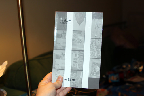
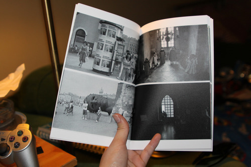
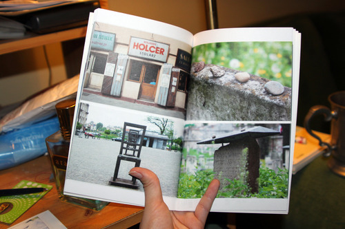
When I received my copy of Krakow: The Journey, I was pleasantly surprised. Throughout my entire project I had hoped to create something in between a zine, a pamphlet, and a pocket-sized guide - and, as such, had some pretty specific requirements that I didn't think a service as basic as Blurb would be able to provide.


The size of the book is perfect. I went with the 'trade' size of 6x9 inches, a little over pocket size. The book sits well on any bookshelf, whilst still retaining a good size for the photos. The cover image consists of 35mm negatives that were scanned in, the full-sized prints of which can be found inside the book. I went with basic text so the reader isn't distracted from the main purpose of the book; the images. While I think the cover works, I don't think the text suits it very well. 


The type of paper used is a rough, ordinary paper: this is exactly what I wanted. I was dreading opening up my book and finding glossy photos reflecting light back at me. The rough texture of the paper is enough to be reminiscent of a zine or pamphlet, whilst the content and the size suggest otherwise. 

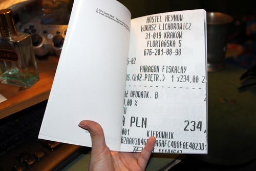
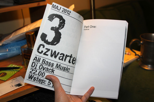
I chose to insert a scan of a ticket, receipt or brochure before each chapter, to separate the sections and also add a sense of personalisation in a book that is otherwise devoid of text. I've only included ones that are relevant: the first one from above is from the hostel we stayed in, Heynow, which was a beautiful and very welcoming hostel that, for the price, offered far more than just bed and breakfast. The second receipt is from the first bar we went to, Alchemy, and a flyer from the night we went - we were promised bass music, and we could hear bass music, but we never managed to find the source and instead had to settle with the fact that, yes, there was bass rumbling somewhere under our feet but no, we couldn't get down there.


The photos in the book are printed to perfect quality. Black and white photos hold the same amount of details as the colour images do, with every pixel sharp and accurate. I work better in diptychs, and as such decided to pair each image up with another, related, photo. There was a little confusion in the Blurb book-making programme about the crop of the pages, and what would be lost - luckily, nothing was lost. My only issue is that in the programme it was only possible to insert one photo onto each page. I had to manually create .jpegs of the diptychs, which were then inserted into the programme. However, the lack of grid layout for images (as exists for texts) made it difficult for everything to be lined up correctly, and some of the pages look slightly wonky in the borders between the images.


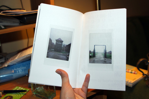
I was quite concerned that my instax from Auschwitz wouldn't work well in print. I was warned by a tutor that they might look out of place alongside the rest of the images, and worked more as a piece of art by themselves. However, I'm pretty pleased with the way that they look. Out of all of the images in the book, they look the most comfortable against the thick white outlines of the pages. Textless and solitary on their own pages, the haunting tone of the instax has transferred perfectly from artefact to paper. 

So, as you can see, I'm pretty happy with the 44-page book I created for the final project of my second year. I'm not going to leave it there, though. I've learned, from putting this book together, what I want and how I want to achieve it. The clinical, wordless pages of my book are slightly too sterile for my liking; I'd rather create something quirky, something that isn't just photography but art and opinions and folklore as well. My plan for next year is to create a series of zines (yep, I've decided I'm gonna go back on myself a little bit) based around cities in Europe. I don't know where I'm going to travel, yet, but the first ones will consist of images and information I have from the places I've been already: Krakow, Berlin, and Prague. Then, I'll create a few more, travelling to each city and documenting everything I see. 

And I won't be alone this time. I'm going to be utilising the skills of an illustrator to assist me in producing my zines. I already have someone lined up, but I want to wait until we have some stuff prepared to show you guys before I reveal their identity. Needless to say, they're kickass. 

If you want a little preview, here is the roughest of rough drafts for one of my pages in the Krakow zine. (For the sake of art, pretend there is an illustration in the middle of the page):


I hope you're all as excited as I am!